
WARNING: This post doesn't really have anything to do with bikes, so avert your eyes if that's all you care about. Remember that the Urban Adventure League blog isn't necessarily a bike blog, it just seems that way!
I don't know what it is in me that gets me riled up about such mundane things. Case in Point: Portland street name signs.
Many cities have a distinctive street sign. They become part of the visual language of the place. They help define the "look" of a town, and can make it easy to identify the town they are in if all we have is an unattributed photo.
For example, see if you can figure out which major West Coast cities these street name signs are from (answers at bottom):
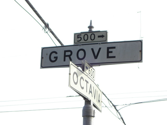 | |||
| A (Photo by Eric Fisher) |
 |
| B |
 | |
| C |
 | ||
| D (photo: Wikipedia user Lukobe) |
For as long as I've been around, the common Portland street name sign looks like this:
 |
| 91st and Stark? What the hell are you doing there? |
Granted, it's nothing special. As far as I can tell, it was introduced to the city around 1960, which would make sense with a design like this. The Interstate era introduced all new standards and materials for road signs. It was the move from more ornate and complicated looking signage, to cleaner, easier to read. It was meant to be seen from a distance and at speed. And the reflective lettering helped night visibility.
Over the past few years a new breed of street name sign has gone up, and it looks like this:

The font and usage of lowercase characters is supposed to be even easier to read than the old 1950's standards. But...I liked the old signs!
I know: attachment to street name signs, Shawn? It's weird, but as I said, the Interstate era Portland signs are part of the visual language of this city. The new signs are the equivalent of a new haircut. Over times, I'll probably get used to them, even like them!

But things aren't changing that rapidly. There has been no impetus to change all the signs at once, most likely due to money.* So the new signs have gone up piecemeal, usually when an old one wears out/gets knocked down, a street naming like 39th/Cesar Chavez, and when there is a major project on a street. So we'll still see the old signs. It might take over a decade to see the last of the Interstate Era signs, as it took awhile for the "Interstate" signs to fully replace the '30's era signs before it.
But I will probably shed a tear when the last old sign comes down.**
Answers: A-San Francisco, B-Los Angeles, C-Vancouver, BC, D-Seattle
*The last whole-scale of street name signs was during the Great Renaming of 1931, which created the familiar Portland "Quadrant" System (N, NE, SE, SW, NW) that we all know and love today. The mass change required every sign to be redone. It was also looked at as a perfect way to employ a bunch of people right during the height of the Depression.
**"Shed a tear"? How weirdly romantic!
Here's a blogger that likes the signs a lot: http://zehnkatzen.blogspot.com/search/label/Address%20Nerd
ReplyDeleteVespabelle--A comment! On this post? ;-)
ReplyDeleteThanks for the heads-up. I actually saw that site during my web searchings for this post, lots of good stuff!