
Hey friends! In my last post I mentioned that I've been working on something special that has taken time away from my blogging, and I would share the fruits of my labor soon. And that time is now!
I've decided to draw some bicycle related comics! Woot! I haven't really worked out a "theme" yet, it's just about myself and those around me and our life with bicycles. There are no characters like Yehuda Whatshisface, though sometimes I'll use potato-shaped people and girls with aviator helmets as stand-ins. (That's about as close as I get to "characters" these days.) I've tried to be as productive as possible on these, with a goal of one a day or every other day. It's taken awhile to get back into the groove of drawering, but I hope to keep the momentum (ha, ha) going!
So here's what I've done so far (remember you can click on any of them to "embiggen"):
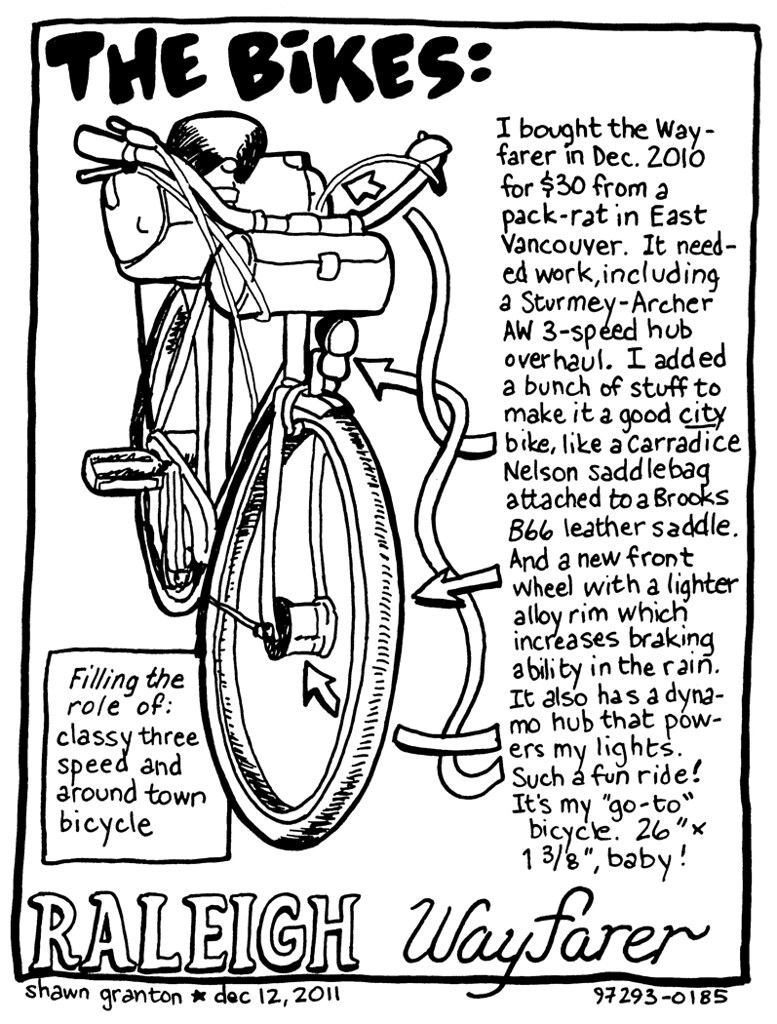 |
| 12 Dec 2011: I decide to draw one of my bikes. |
 |
| 13 Dec 2011: Yes, based on an actual conversation I had in front of People's Co-op. |
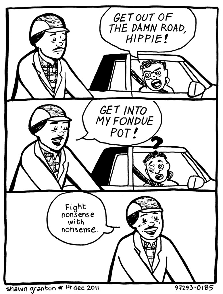 |
| 14 Dec 2011: God bless you, Captain Beefheart! |
 |
| 17 Dec 2011: I can draw a good Keith Giffen homage every once in a while. |
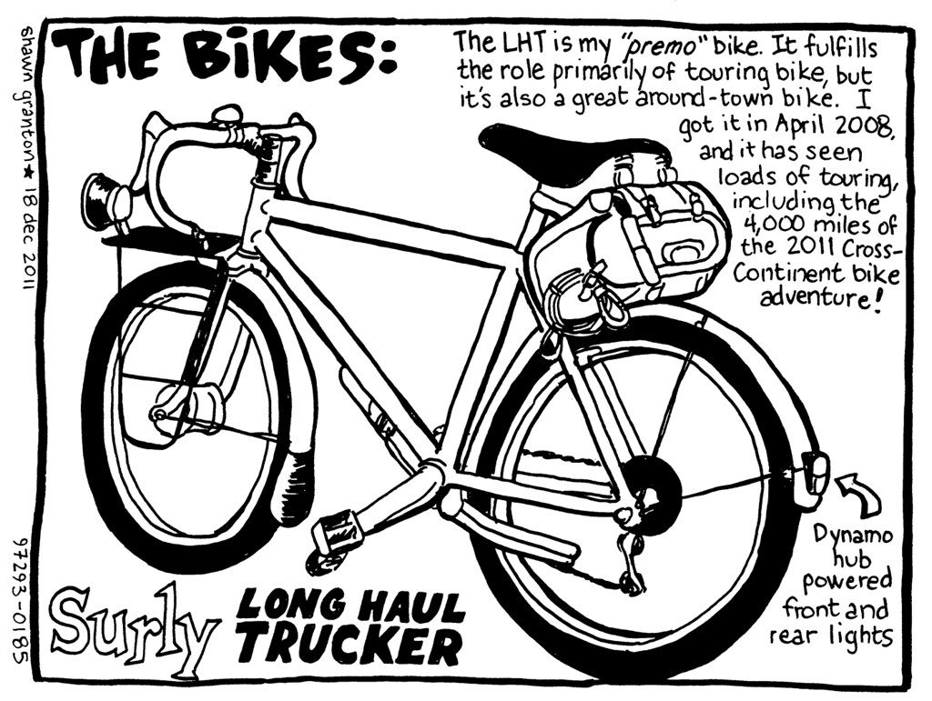 |
| 18 Dec 2011: I decide to draw another one of my bikes. One more to go! |
I intend to keep on doing them and see where it goes.
And I'll be posting them occasionally on the blog here. You can also check out my sito art page and my flickr photostream, where they will also be posted.
What do y'all think?
AWESOME!!! :D
ReplyDeleteSteve
Wow, these are awesome.
ReplyDeleteThose drawings are fantastic, I love how you have explained each of your bikes and their purposes
ReplyDeleteMighty fine comics.
ReplyDeleteThanks for the compliments, folks!
ReplyDeleteThey are really good.
ReplyDelete(Sorry, a little behind in my blog reading)
Great stuff, Shawn. I need a "Get into my fondue pot!" t-shirt.
ReplyDeleteI like the retro eyeball thing and the Gasoline Alley-style lettering. I don't think you need to work so hard on bolding the lines with today's reproduction specs. Although, you may want to try brush and ink instead of Sharpie. Or a combination of both. The bike drawings remind me of the illustrations in Tom Cuthbertson's classic, Anybody's Bike Book. Except you have just the right amount of detail and no more. That's harder than it looks.
ReplyDeleteTo steer clear of typical Portlandia ruts, how about a character who's a little older and is oblivious to all the bike preciousness around him?
Thanks for sharing!
Don, thanks for the comments!
ReplyDeleteRe: bold lines, that's just the way my style has developed over the years. I don't use Sharpies anymore, though I did at one point. My current pens of choice are Microns and Faber-Castell Pitt pens.
I've tried brush and ink a bit in the past, but didn't really like it. I won't say that I won't ever experiment with it agai, but two things hold me back: I'm drawing these comix fairly small, and it seemed like brush worked better when I worked larger. Also, I don't have a home studio and usually draw in my sketchbook, so I value portability. I'd worry about bottles of ink leaking in the bag, having to clean up while in a coffee shop, etc. Yes, modern tech pens are not traditional, and old-school artists feel like I'm "doing it wrong", but I find that it works for me. To each their own.
As for characters, the guy in the mustache is "me" or the cartoon version of me. The comix are supposed to be semi-autobiographical. I'm writing from what I know and what happens to/around me. Yeah, it can be the Portlandia cliche, but that's my life. Having an "out of the loop" character is a good idea, though.
True about size and brush. I could never work in coffee shops like that. The portability thing actually sounds very appropriate for bike comix. The bold line does allow your drawings to shrink down beautifully, so you could do a busy, slice-of-life streetscape with dozens of characters a la Herge, and it would probably read clear as a bell. Of course, it would have to fit in your Carradice.
ReplyDeleteSorry, I didn't mean to imply that your character/persona was a cliche, only that it might be hard in the future to avoid falling into one with all the Portlandia stuff out there. I actually think the retro drawing style helps neutralize the hipster dangers. And your stuff is celebratory, so let the positivity flow!
Cheers
Don-
ReplyDeleteNo offense taken. I do realize that the territory I'm treading into can steer towards cliche. I think the problem isn't Portland per se, but the subject matter. Bike specific comics can only be understood by those "in the know". And I'm not doing the typical roadie/MTB stuff, either. All I'll say (for now) is let's see where this goes...
Thanks for the critiques!